Wednesday, June 25, 2014

Pink and Blue Wedding Redone

I won't name any names, but last a month the daughter of a fairly high-profile "reality tv" family got married.  I'm  a huge advocate of weddings being about the bride and groom and what THEY like and want, but her wedding was a complete and utter hot mess. It looked like Pinterest went to the county fair, ate too much cotton candy, and then vomited everywhere.  The bride chose hot pink and malibu blue as her colors, which isn't too horrible when you consider she is 19 years old and should have a theme that reflects youth and fun and free-spirits.  However, this wedding could have been much classier and looked a lot better if it had been toned down just a wee bit.
Eyelander Photography Island Wedding

To start with, pink and blue aren't inherently clashing.  If you choose the right tones of each they can be very gorgeous and fun.  For early spring, pastels work beautifully together along with white or cream accents.  For hotter weather, navy and hot pink are absolutely rocking! Even hot pink and a bright blue like Malibu blue can work well together if you keep the number of design elements to a minimum and use a clean, bright white to accentuate the details.
Tiffany Blue w/ Pink Accents

Dog-Gone Darling Pink and Blue by The Wedding Chicks


The worst thing about this wedding in particular was how muddled and messy the colors looked.  Each of the bridesmaids wore a different style of "modest" satin gown in either blue or pink, making it look like a bunch of teenage girls decided to recreate the 80's.  I personally think it would have looked better if all the bridesmaids had been wearing blue dresses and carrying pink bouquets instead of alternating blue/pink and carrying mixed bouquets.  At the very least, if the dresses had been simplified and not enormous and poofy it would have looked much more elegant.  For example, this wedding pictured to the right has a kind of fun and shabby-chic atmosphere thanks to the varied shades of simple pink and blue bridesmaids dresses.  Still not my favorite look ever, but it looks clean and refined and not messy or immature.  I like how the bouquets are mostly pink and white with just a touch of blue thrown in, and all the colors complement each other.

If you're thinking about a pink and blue wedding check out my Pinterest Board for more classy inspiration and ideas.  

Navy and Pink Bridesmaids


Tuesday, June 24, 2014

Book Review: A Gift of Time

The latest in Sarah Wynde's Tassamara series did not disappoint in the least. In fact, I though this was the best book yet. The story of Natalya and Colin was incredibly sweet and detailed. The main characters are very well developed and multi-dimensional. Pop culture references are flawlessly sprinkled throughout the book, making it feel like reading about real people. Some authors struggle when writing a contemporary setting because it seems like they try to hard to force pop culture into random spots, but that is not so in Tassamara. I did wish that a few of the other characters played a larger role in this novel, but for a relatively short read it was about perfect! Here's to hoping Wynde continues treating us to her wonderful Tassamara world so we can be reunited with the GD folks, ghosts, and other residents of this delightful town.
A Gift of Time by Sarah Wynde

*I received a copy of this book free of charge in exchange for my honest review. All opinions are my own*

Monday, June 23, 2014

Free Crochet Patterns for Baby

Here are my latest free crochet graphs. This week I'm posting a selection of adorable baby blanket and nursery decor patterns.  All of these patterns are designed to be made using the single crochet method, with one block equal to one stitch using a worsted weight yarn and size H hook.  Enjoy!

*If you would like to make the piano blanket with a different initial, just let me know and I can make one for you. I'm spend a few hours on each set of patterns to make sure they are easy to follow and look good and I am providing them all free of charge so please do not sell my patterns or the finished product.*

Floral Bright Baby Blanket

Child's Giraffe Pillow

Piano Baby Blanket

Teddy Bear Afghan

Valentine Bear Afghan

Sponsored Links: Save 15% off entire order at LeisureArts.com. Use promo code ART15. Save 20% off any Knook product at LeisureArts.com. Use promo code KNOOK20.

Sunday, June 22, 2014

A Pinterest Plea

I love Pinterest.  I use is almost daily and it has been a tremendous help in finding new recipes to try and various handy tips for cleaning and organizing my home.  Plus, who doesn't love looking at pretty pictures and finding inspiration for a beautiful life?  However, I'm seeing a disturbing trend of people who use things they see on Pinterest verbatim, with absolutely no regard for uniqueness or personalization whatsoever.  This is especially bad with weddings.  

Weddings are supposed to be all about the bride and groom as a singular, unique couple with a love story that is theirs alone.  When you just use whatever popular ideas you find on Pinterest without changing them to be unique to you, you end up with a wedding that doesn't stand out at all. Using the exact same signs, picture poses, decorations, etc... is not cute and I really believe that in 10 years you will look back and wish you had taken the time and effort to make your wedding more unique and personalized.

I'm not knocking Pinterest, or brides who use Pinterest for inspiration at all, but that's just it; Pinterest should be used for inspiration, not just to copy and paste some trendy ideas into your wedding plans. Find an idea you like and then change it to make it yours. Use quotes that actually mean something to you and aren't just the popular, cutesy, love-dovey saying du jour.  Pick colors and decorations and details that are important to YOU and that really reflect your interests and passions.  Your wedding should be about YOUR love story and your history as a couple and it just isn't possible to show all that when you only use the most popular ideas that everyone else is using too.


Here are some of the most popular pins that I absolutely cannot stand and am sick of seeing:
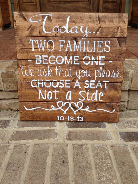
UGH. "Choose a Seat, Not a Side" This trend needs to stop.

Dumbest trend ever

"Bridesmaids" is not even cool. Stop.

Dumb, dumb, dumb. And way overdone.

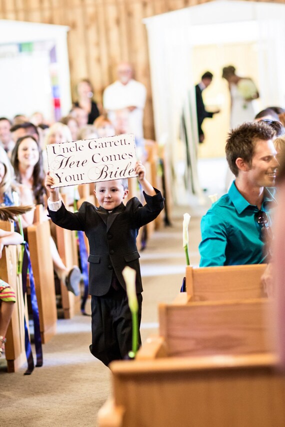
Who even does this? It looks awkward and unnatural. Ewww.


Saturday, June 21, 2014

More Free Crochet Patterns- Modern Pillow Patterns

I like crocheting my own decorative pillows because it saves a TON of money! Pillows are expensive, especially if you like to change your decor seasonally.  It doesn't take much time to crochet these pillows and you can make them in the exact size, pattern, and colors that you want.  A basic skein of RedHeart brand yarn costs less than $5 and can be used to make several small-medium sized pillows. For a lot of the modern, intricate patterns that are in fashion right now I recommend making a single-crochet background square and then cross-stitching your design onto that. Here are several free designs to get you started: 

Scale Pattern Pillow

Modern Pillow #3


Leafy Pillow

Modern Pillow #1
Modern Pillow #2


Now on Bloglovin!

Follow my blog with Bloglovin Hey everyone, I'm now on Bloglovin' so feel free to follow me there to stay up to date with all the latest FauxMenno posts!

Friday, June 20, 2014

More Free Sports Crochet Charts!

I recently finished up a few more sports teams logos to crochet into throws or stadium blankets. I have been concentrating on college teams that are important to my family and friends, but I can make any other team by request, or you can give it a try yourself. I also now have the option to make larger sized afghan charts instead of only smaller throws.
 
Once again, please only use these patterns for personal use.  If you attempt to sell the pattern or the finished products you are breaking the law.  These make excellent gifts, but it is not okay to profit monetarily from someone else's intellectual property.

As with my other sports logos, if you want the full size .jpg pattern, just email me and I will send it to you until I am able to have them hosted externally.

#1 Bowling Green State University 


This chart shouldn't be too complicated to follow. Use 4 colors of yarn to create this charming falcon logo.  I recommend making this throw longer by adding rows of the background color to the top and bottom and also adding a border of orange, brown, or both.


#2 The University of Georgia


Support your favorite SEC team with this simple G logo stadium blanket. Extend to whatever size you like by adding rows to the top and bottom, or to both sides, and then finish off by adding a bold red border. Go Dawgs!


#3 Michigan State Spartans

Clean lines and contrasting colors make this Spartans logo really stand out. Simply add three or four rows of white border and you have the perfect stadium blanket to fend off those chilly Michigan breezes.


#4 Miami University (OH) 

Love and Honor to Miami! The original and best Miami, that is.  Show your school spirit with this striking throw. All it needs is a few more rows of white around each side and then a red and black border and this blanket is ready for the football stadium or dorm room.


Keep an eye out for more patterns as I will be updating regularly. Remember, email me if you would like these charts and you can always make your own at:
http://stitchboard.com/pages/pattern/freePatternWizard.php

Save 20% off any Knook product at LeisureArts.com. Use promo code KNOOK20.